
Components.
The building blocks we make Haralt with, straight from src/components/haralt – with the states they have. Only what recurs across pages is here; what belongs to a single screen is left out.
Buttons
ui/button.tsx · ui/button-link.tsxRadius 999, weight 700. Heights lg 52 · md 48 · default 44 · sm 38 · xs 32. Arrow only on step buttons. Disabled: opacity .45. A button that is waiting keeps its full colour and gets a spinner and a waiting text – see Loading.
Chips
haralt/Chip.tsxSelected = ink/white. Unselected = cream 96 %, hover 92 %. Green is not “selected”. White chips are suggestions under the search field.
Pill bar and segmented choice
haralt/PillBar.tsx · haralt/Segmented.tsxWhite pill bar, 4 px padding. Active = ink with white text (stays black on hover), inactive hover = cream. Same pattern for the menu, Map/List and NO/EN. The segmented choice is a cream pill with equal-width options, for two or three choices in a form. Breadcrumb and avatar belong to the page header.
Form fields
haralt/Field.tsx · ui/switch.tsxNo border: cream 96 %, radius 14. Focus = 1.5 px green + white. Error = 1.5 px red. Disabled = same fill, muted text. The placeholder is always an example.
Radio choice
haralt/RadioCard.tsxSelected = 1.5 px ink edge + 18 px ring with a 5 px stroke. Unselected = 88 % edge, ink on hover. Dashed edge for the option outside the list. While the choice is being checked, the subtitle becomes a waiting text and a spinner takes the status's place. When several can be chosen, use the check circle: 22 px, green with ✓.
Status labels
haralt/StatusLabel.tsxGreen = active/available (dot only on “ongoing”), amber + clock = waiting on someone, red = declined/error, grey = done. Brand yellow = delivery method, not state. The order flow also has strong surfaces for what is happening now: ink, green and white. Fact labels follow the status label.
Product card and image stack
haralt/ProductTile.tsx · haralt/ImageStack.tsxWhite, radius 22, 1:1 image with object-fit: contain and no background. Hover: lift 2 px + shadow. Without an image, a cream surface. The last tile in a grid is always the dashed “Missing something?”. Things that belong together show as a stack of at most three: small tiles in lists, tilted pills at the top of an order.
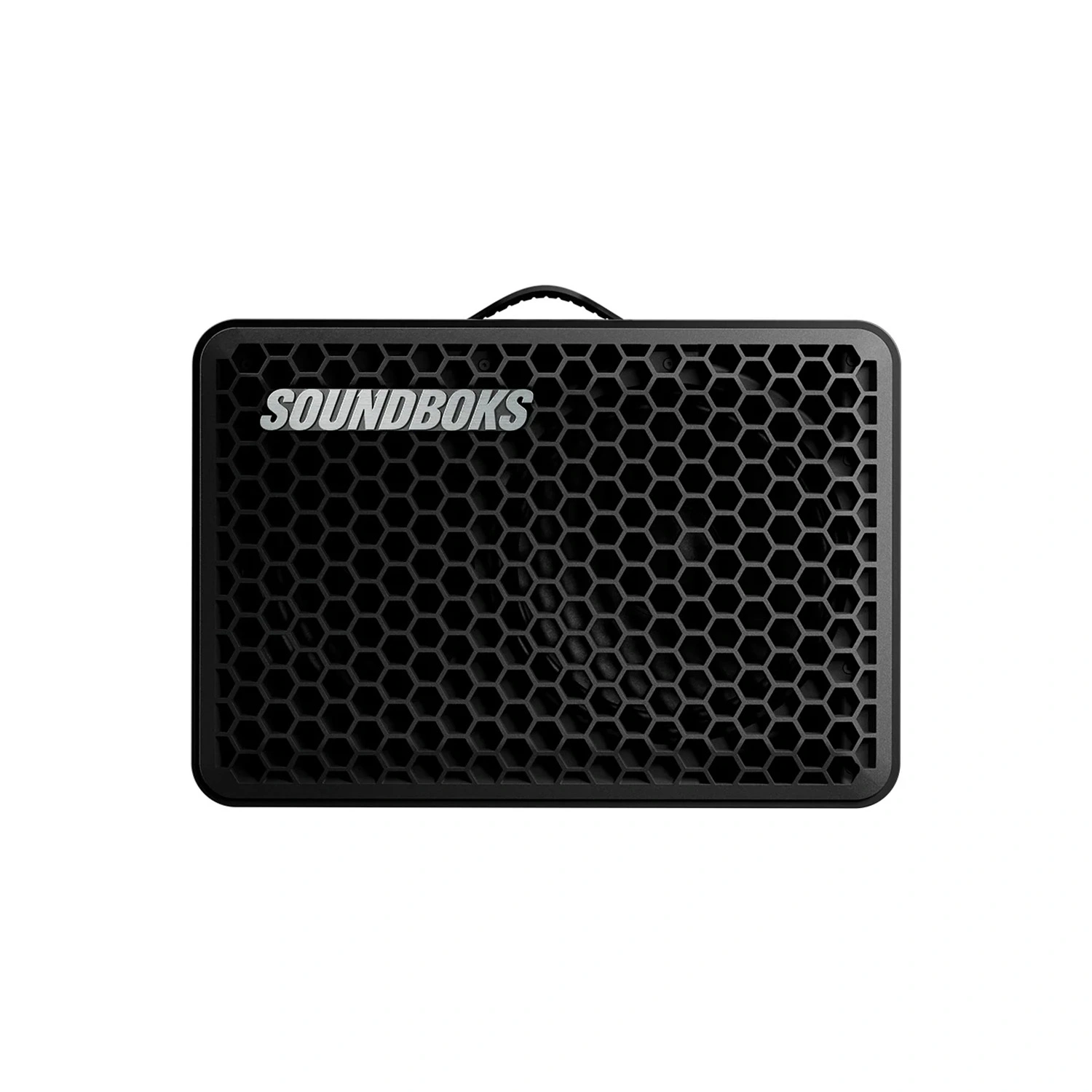 Soundbox GoLocker · delivery
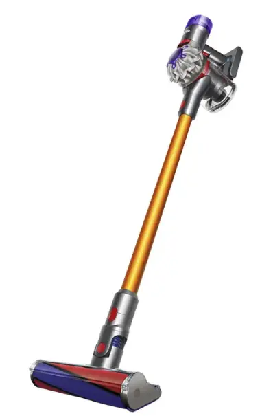 Dyson V840 kr/hourCarpet cleanerPhoto comingMissing something?Tell us and we'll get it.

Numbers and facts
haralt/StatTile.tsx · haralt/FactTile.tsxStat tile: value 18/900 over a muted label, on white or dark. Fact tile: uppercase label over a value 15/800, in a grid that fills the width – on cream, green and dark cards. Progress is 6 px with rounded ends.
Price box and receipt
haralt/PriceBox.tsxCream price box, radius 18: lines in secondary text, the total with a divider above. A green total is the daily cap on the product page. The receipt is a white card max 520 with the price box.
Timeline
haralt/Timeline.tsxWhat has happened and what is coming, with 18 px dots: green ✓ = happened, yellow with a dark edge = next, white = later, grey ✓ = last in a finished run. The line is green between two things that have happened.
- Request sentMon 14:02
- Haralt confirmed the packageMon 15:30
- Paid – booking confirmedMon 16:10
- Delivery Fri 17–20 (neste)
- Pickup whenever you like
- Request sentMon 14:02
- Paid – booking confirmedMon 16:10
- Delivered to Kirkeveien 12Fri 18:05
- Picked up – settledMon 10:20
Icon rows – light and dark
haralt/IconRow.tsx38 px icon box radius 8, Lucide 18 px, title 14/700, subtitle 12.5. Always three points. Dark card: yellow eyebrow, inverted icon.
Settings card
haralt/SettingsCard.tsxSame skeleton for all: icon box + title 17/800 + subtitle, content, footer row with a divider – note left, action right. “Delete” is always its own card at the bottom.
Payment
Delete account
Status banner
haralt/StatusBanner.tsxGreen = confirmed, dark = needs action. Always its own card, never inside a white one. The large variant, with a timestamp eyebrow and a personal title, is the confirmation after a submission.
Error box
haralt/ErrorBox.tsxRed is only used here. Placed right above the button it concerns. Text = what happened + what did not happen + at least one way out as a link.
Empty state
haralt/EmptyState.tsxNever a dead end: 56 px “?” circle, title with the search term in quotes, one secondary + one primary action.
We don't have “popcorn machine” on the shelves yet
But we can get most things. Tell us what you need and when, and we'll reply as soon as we can.
Toast
haralt/toast.tsx · ui/sonner.tsxDark pill bottom centre, 2.8 s, a new toast replaces the last. Only for actions without their own screen – never for anything the user must read carefully.
Modal – confirm and block
haralt/Modal.tsx · ui/dialog.tsxInk overlay at 55 %, click outside closes. Card min(460px, 92vw), radius 26, padding 30. Filled red primary only when the action is actually available; a block is shown as an error box with a way out.
Loading
haralt/Skeleton.tsx · haralt/Waiting.tsx · ui/button.tsxShow as little as possible, as late as possible. Nothing shows under 300 ms. A page being fetched gets a skeleton shaped like its content – never a logo or a spinner in the middle of an empty page. A page change that takes over 300 ms gets a 3 px green line at the top. A button that is waiting gets a spinner and a waiting text in full colour, and stays at least 500 ms once shown.
Same shape, radius and padding as the card that is coming. Each card pulses, slightly staggered. At most six cards or three rows.
A 3 px green stripe on a cream track. After 10 s a way out appears, after 30 s an error box.
A spinner where the icon was, a present-tense verb instead of the label. Dots when a person is working, a spinner when a machine is.