This is what Haralt looks like.
Logo, colour, type, shape and tone – everything you need to make something that looks and sounds like us. Colours and radii below are read straight from the tokens in code, so this page is always current.
Logo and symbol
The wordmark sits at the top and bottom of every page. The symbol on its own is only for the favicon, the main warehouse map marker and small surfaces.



- Never stretch or rotate the logo.
- No shadow, outline or gradient.
- White version only on dark or green surfaces.
- Let it breathe – at least the symbol's width around it.
Colour – brand
Green is the voice, yellow is the action, cream is always the background. No gradients.
--color-brand-secondaryhsl(150 50% 40%)--color-brand-secondary-hoverhsl(150 50% 30%)--color-brand-primaryhsl(46 93% 62%)--color-brand-primary-hoverhsl(46 93% 52%)--color-bg-canvashsl(42 39% 94%)--color-bg-mutedhsl(42 39% 96%)--color-inkhsl(30 3% 11%)--color-bg-surfacehsl(0 0% 100%)Colour – neutrals
The neutrals are cool (hue 240) against the warm cream – calm text and edges that never turn grey-brown.
--color-text-mutedhsl(240 4% 50%)--color-text-secondaryhsl(240 4% 40%)--color-text-placeholderhsl(240 4% 60%)--color-text-eyebrowhsl(240 4% 55%)--color-border-defaulthsl(240 6% 88%)--color-dividerhsl(240 6% 92%)--color-border-underlinehsl(240 6% 85%)--color-border-dashedhsl(240 6% 80%)Status colours
Four states, four colours. Red is only for errors and things that were declined.
--color-success-bg · 150 35% 88%--color-success-fg · 150 50% 28%--color-warning-bg · 42 93% 90%--color-warning-fg · 36 70% 28%--color-danger-label-bg · 0 70% 94%--color-danger-fg · 0 55% 35%--color-neutral-bg · 240 6% 92%--color-neutral-fg · 240 4% 40%--color-danger-bg · 0 70% 97%--color-danger-fg · 0 55% 35%--color-bg-surface · 0 0% 100%--color-danger · 0 65% 45%Type – Geist
One family, weights 400–900. Big headings heavy and tightly tracked, body text light. The bigger, the tighter. No italics.
Display · clamp(44–118) · 900 · −0.05em · capsH1 · 34–64 · 900 · −0.05emH2 section · 28–40 · 900 · −0.04emH3 / card title · 22–24 · 900 · −0.04emLabel · 14 · 600–700Body · 13.5–15 · 400 · line height 1.5Help text · 12.5 · mutedEyebrow · 11 · 700 · +0.6px · capsShape – radius, shadow, spacing
Anything interactive is round (pill). Never sharp corners.
68121418222836Spacing in 6/8/12/14/18/22/28/36. Page: max 1160 px, gutter clamp(16px, 4vw, 36px), 40 px top.
Images and icons
Real product photos on white, cut out. In headlines: pills with a slight tilt (±2–4°). In grids: 1:1 with no background. No illustrations, no stock photos of people.
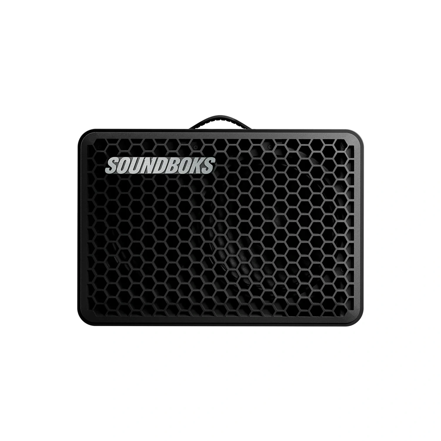

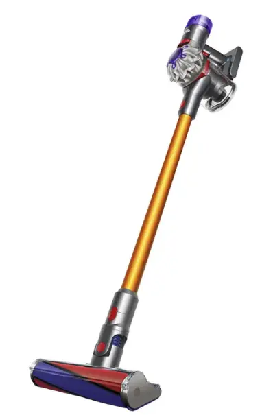
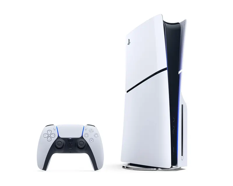


2 px stroke in ink. 22 px in lists, 18 px in icon boxes, 15–16 px in buttons. Never coloured, never filled. “?” and “+” are type, not icons.
Tone of voice
You/we, never “the customer”. Short sentences, the dash as a breath. Playful but concrete – always promise something measurable.
- “Ok – almost everything. If we don't have it, we'll get it.”
- “Just ask – we'll sort it”
- “Real people check that everything is in stock.”
- “Our comprehensive rental portfolio”
- “Contact customer service for assistance”
- “Your request has been registered in the system”
- Buttons say what happens: “Rent today”, “Next – when and where”.
- No emoji, no exclamation marks except “Your request is sent!”.
- Error text = what happened + what did not happen + at least one way out.
Principles
- One yellow button per screen
The next step is always obvious. Everything else is a text link or a white pill.
- No account, no payment until we have confirmed
Say it often. It is the promise that keeps the threshold low.
- The page makes room, it does not switch
Cards grow out of what the user tapped – not a modal or overlay.
- The products are the heroes
Real photos everywhere – headlines too. No icon where a photo can go.
- Never a dead end
Empty states and errors always have a way forward.
Buttons, fields, chips, labels, cards, banners, modal, toast and loading – with states, straight from the code.
Open the componentsQuestions about the brand, or need something that isn't here?
hei@haralt.co